Concur Itinerary
UX | Design
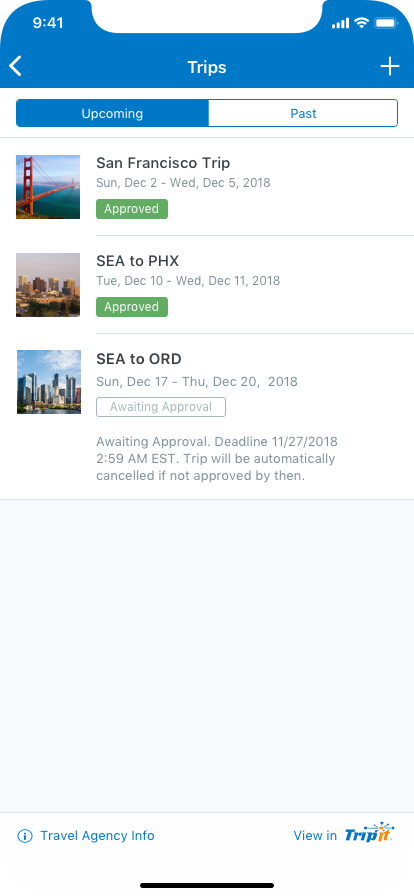
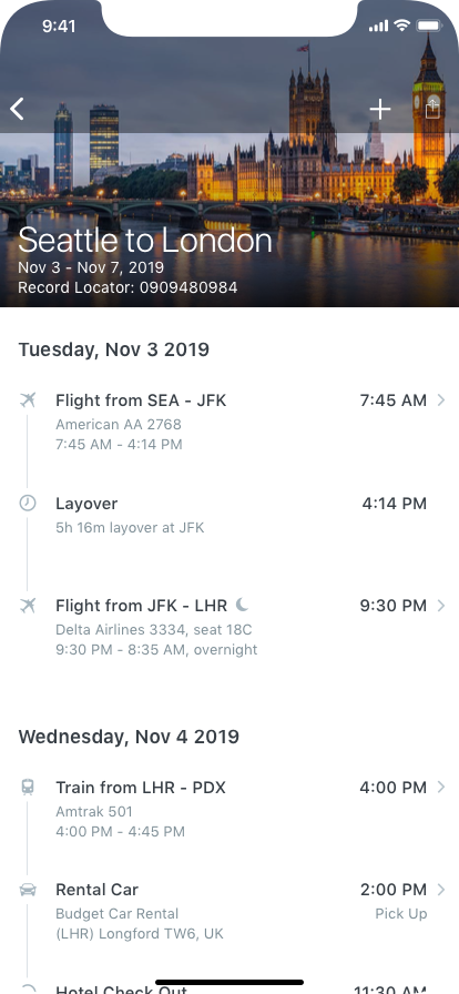
Redesign of the Concur itinerary page. It's the second most used page in the app behind expense so we wanted to give it an update. We actually had another card-based design for the itinerary but we didn't want to throw that big of a change at the users all at once. Especially since that was just biting us in the butt on the web side of things with expense. Either way, this tested well also and we were able to sneak in a couple of new features like offline mode and itinerary sharing even though we were playing the waiting game with the back-end apis to give us the info we really wanted like up-to-date flight times/gates/etc.
The Problem
With some technical challenges we had internally, we could't get any new back-end services to feed our itinerary. However, with over 3 million monthly views, we knew that even just cosmetic update would still be valuable and we could see if we could improve anything else along the way without having to rely on any new APIs.
Results
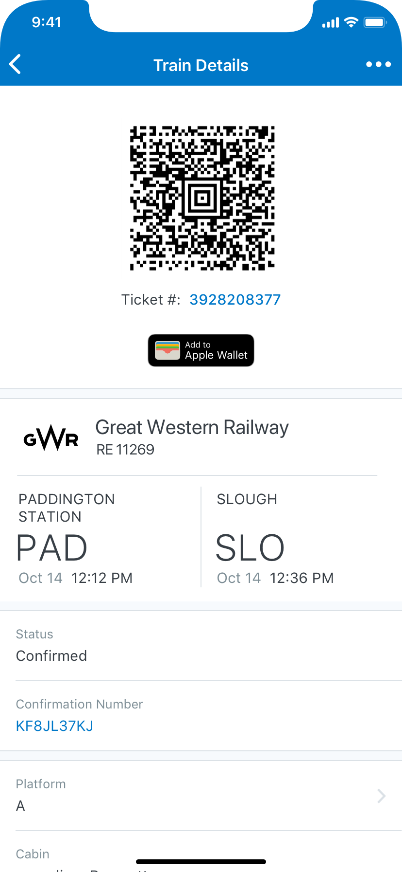
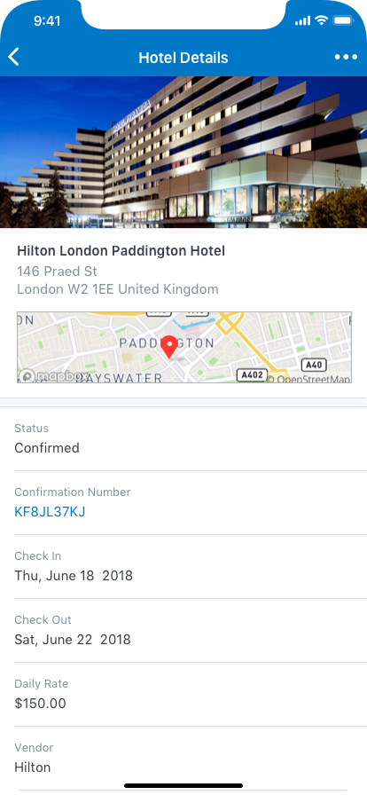
Using the existing itinerary services, we were able to add a photos (yes, we manually sourced and collated lots of images) to the existing trips. Also, we were able to add the ability to share your trip with someone just leveraging the platform without any extra services needed. Another advancement we were able to make was one that customers had been asking for on a regular basis - offline mode for itinerary. Previously, every time you opened your itinerary, it would download it. This meant if you were on the airplane - a pretty common place to check your itinerary - you were out of luck unless you were connected to the plane's wifi. So, we cached the data that we received the first time the itinerary was viewed, and read from that while in the background, we checked for anything new or changed.
flows