Mobile Hotel Booking
UX | Design
Redesigning the hotel booking flow was my first responsibility when I joined Concur. After the new flow and design was tested, we did a short internal beta and then released to the public. Unfortunately, none of this was instrumented for analytics before we re-built it so we don't have any metrics on if we improved time on task, conversion, engagement, customer sat, etc. However, we have increased number of bookings over the past year from
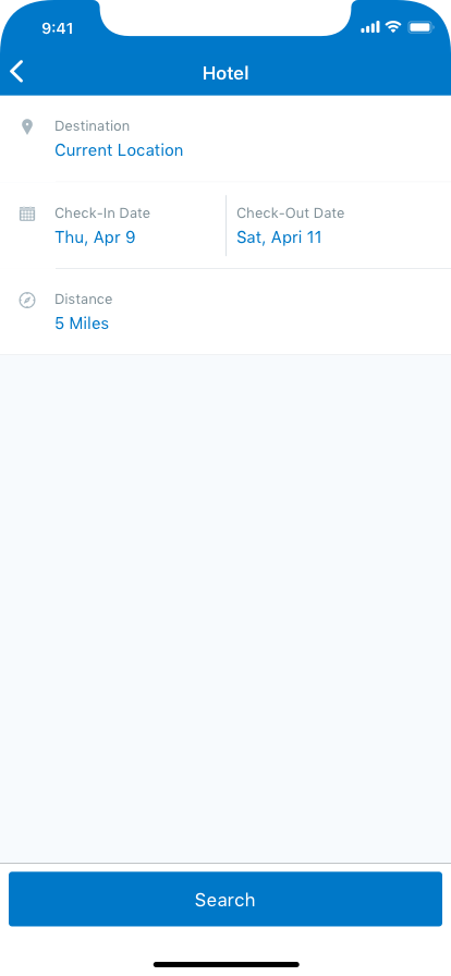
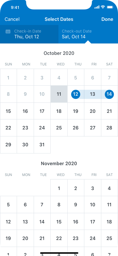
Search
We simplified the search criteria page and added a "Most Recently Used" list for the location lookup. We also added a new calendar picker to replace the standard iOS spinner-type calendar.
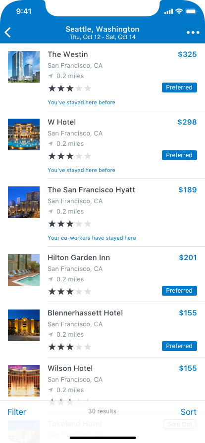
One of the big selling points of the Concur travel solution is overlaying policy on the search results. However, we found out that for the heavy business traveller (out mobile persona), policy wasn't as important. We decided to compromise by adding the "dog ear" to the the results to display policy violations. This way, the user can see what's in policy at a glance, but the screen isn't cluttered up with a bunch of icons and descriptions all at the same time.
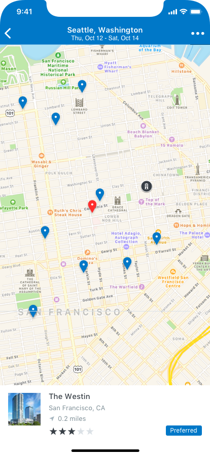
Results
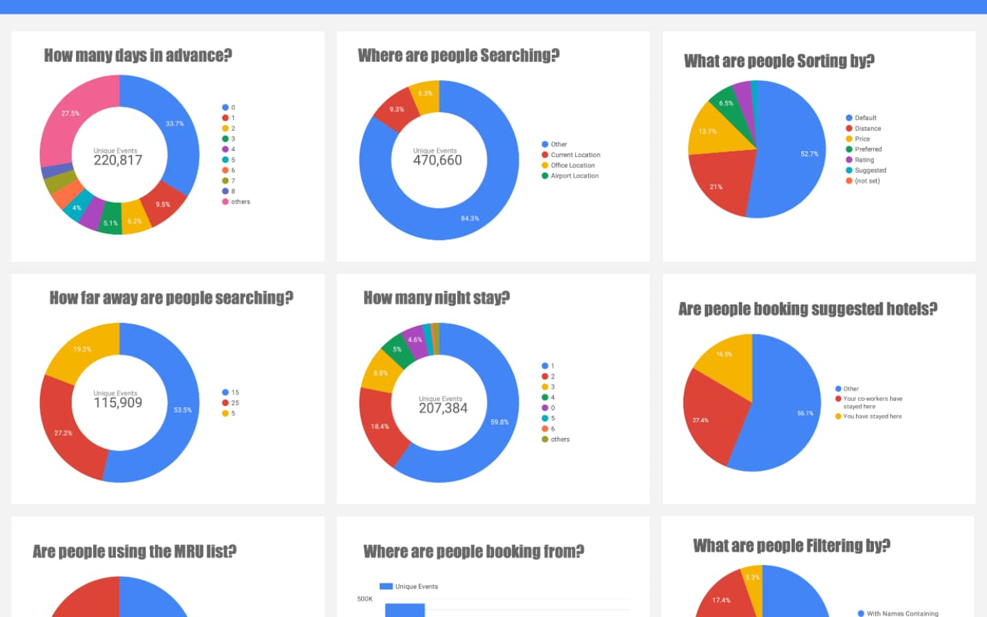
Due to some limitations, we were unable to bring back prices for all of the hotel results immediately - we could only price the first 10. In order to mitigate this, we made a hypothesis that the frequent business traveler (our persona) would want to either stay at the same place they're used to staying, or stay somewhere a colleague is staying. So the first 5 search results for any given location consists of any place you've stayed before first, then any place co-workers have stayed, and then the most popular places after that. Checking the analytics confirmed our hypothesis with 80% of users choosing from the top of the list.
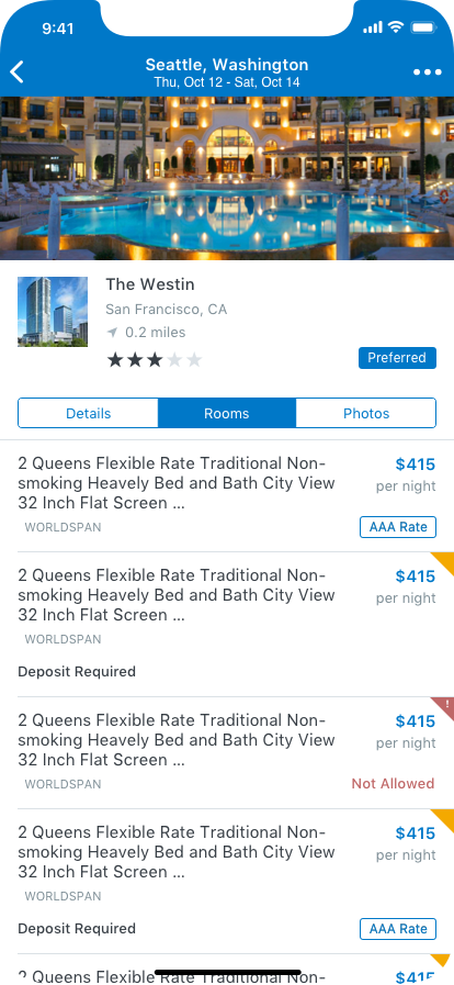
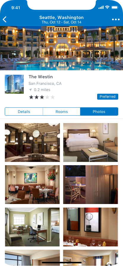
Hotel Selection
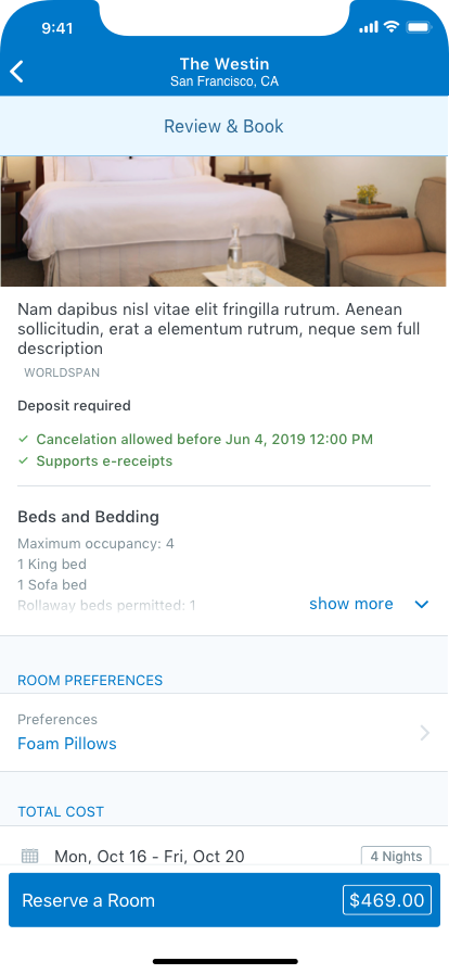
Upon hotel selection, we show the rooms, hotel details and photos all in their own tab - defaulting to the rooms tab. From here the user is also able to access the map and see how far the hotel is from any of their office locations, check out photos of the property, or just select a room for booking.
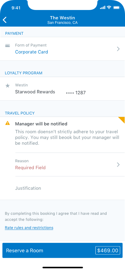
Checkout
Again, we greatly simplified the checkout process compared to the web version. They had 4 pages of checkout and we have just one. Here you can see your final price, add your loyalty and form of payment, and see and address any policy violations that may arise.
Metrics
The product owner and I worked together to define the analytics we wanted to implement based on what questions we wanted answered and what we could use to improve the design.
I created a number of GA dashhbaords that displayed everything from number of bookings to how well our recommendations were doing. These ended up informing a number of later decisions we made both with the design and the product in general.
flows